Showing posts with label color inspiration. Show all posts

Saturday, May 5, 2018

Spring At Last


Earlier this spring, my friend, Debbie, shared this photo of crocuses blanketing the landscape like a colorful patchwork quilt. The moment they emerge, often while there's still snow on the ground, their hardy blooms seem to dance with abandon like they're grateful to be leaving winter behind... and aren't we all?


 she took at Flowers on Fargo, a private garden in Geneva, Illinois. Each spring, it bursts into color  with crocuses, tulips, and other flowering perennials. Check out the link above!  


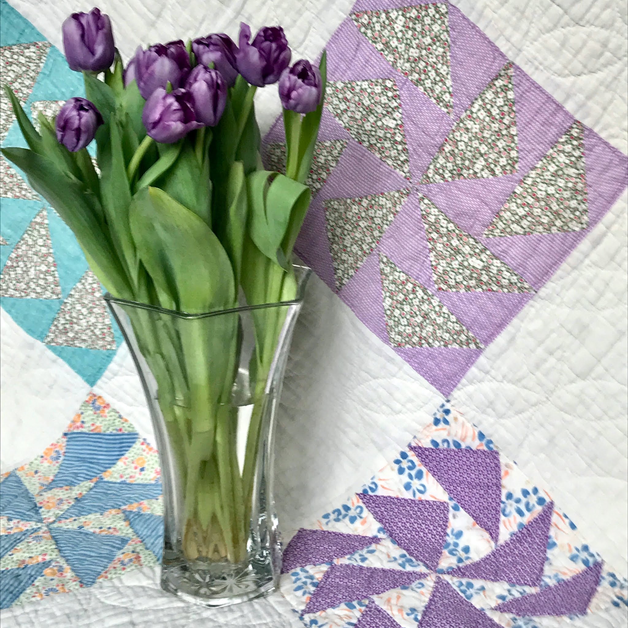
Perhaps it's the colors that drew me to this vintage Dutchman's Puzzle quilt. Do you suppose the maker had crocuses in mind when she pieced those purple triangles or was this just a popular color scheme in the 1940s?


All those triangles


poking through a bed of white


to dance their way across a quilt


sure look like crocuses to me!


Wishing you all a happy spring & summer!

Monday, February 21, 2011

Primrose Surprise


Well, everyone, it's still February, the shortest month of the year that always feels looonger than the rest! Let me guess what you might be craving about now... a bit of color, perhaps?


My quilting friends delivered big time when they visited for my birthday. with this gorgeous basket of primroses! Aren't the amazing (the friends and the flowers)?a mega-dose of color technicolor


The rich velvety blooms reminded me of a signature quilt I made years ago. Wow, it's a perfect match!


It commemorates a special group of friends the year we all turned forty.

Although the fabrics were bright, they mostly read as medium tones. Without a strong contrast between them, I had to rely on something other than lights and darks to create the design. 


Instead, I set "warm" colors (pink, orange, yellow) against "cool" colors (blue, green) to create contrast.


Notice how the cool colors recede, while the warm colors advance, creating a sense of depth particularly visible in the zig-zag border.


Save your scraps! I used a few to spruce up the label on the back of the quilt.


Lordy, Lordy, We're 

Turning Forty!

20" x 25"

machine pieced, hand quilted

Diane Burdin, 1996


Monday, July 30, 2007

Color Study


Hello everyone. I've been thinking about color lately--what I like and why I like it. My preferences are more instinct than anything else; I know what I like when I see it. As for why, I don't particularly care.  


When I spotted this peculiar paisley fabric in a friend’s scrap bag, something about it drew me in for a closer look. The colors were muted, and not particularly pretty. 

To narrow down what intrigued me, I googled "green and lavender color scheme" and used an online resource called Color PalettesMost of the combinations were either too pastel or too vibrant for my taste, until it came to these:

I liked these soft, grayed shades--


but this one was even better!

Bingo!

Turns out, it was the low-contrast blending of colors that I liked so much! Once I chose green and lavender fabrics of similar value, I was able to create the same effect that drew me to the paisley in the first place. Here, have a closer look! 


A reader asked if I use patterns when making my quilts. Commercial patterns, no, but I like drafting things to the size I need for a particular project. In this case, the Variable Star blocks measure 4” because that's all the paisley print I had to work with. The finished quilt is 10"x10.”


Even the smallest quilt deserves a label. My friend Laurie Peters designed and inked this one for me.


Friday, July 13, 2007

Marimekko Surprise


You may wonder how I decide which quilts to post about next. It's pretty random, really. I use those I can get my family to photograph. Allowing for factors like timing, lighting, setting, mood (of the photographer) and how much groveling I need to do, there can be quite a wait for quality quilt photos.

Today's quilt is up next simply because the pictures are already on my computer. Be forewarned! It's not my usual style or color palette.

It began with a shopping bag left on my doorstep, brimful of Marimekko fabric. These contemporary, decorator weight designs come from Finland and are sold at Crate and Barrel stores. A good friend who worked at C&B left them for me as a surprise!

Who can resist free fabric, even when it veers wildly from your usual style? This print became my theme, mostly because there was enough to use as a border. Let's see, day-glow squares on vibrant orange... What quilt block might work well with that? Four Patch? Nine Patch? Both seemed too ordinary, too predictable.


For the unexpected, I turned to the cover of Kaffe Fassett’s Glorious Patchwork. Based on the colors in his quilt, my wacky orange fabric might read as a neutral!


I made 3”, 6”, 9”, and 12" blocks from some of the brightest colors I'd ever seen. The challenge was to balance both color and block sizes throughout the quilt. I sewed until every square inch of fabric was gone!


The finished quilt was given to the fabric gifter herself, just in time for her 17th birthday. She absolutely loved it!